The newspaper I got was The Daily Mail and after devouring it's contents I came to the decision of using a story/subject which happens every day and has some extremely negative effects on both children and adults connected to an online community on any social networking site or game.
The headline reads "Internet trolls' sick taunts over Adele's baby boy" - this is referring to the disgusting posts the public began making about Adele when she released information about her new born baby.
Post examples include
"@PerfFemale: Aw Adele gave birth to a baby. Is it fat and handicapped lol. Just murder it already lol"
"@AmyCunnningham: Didn't even know that Adele was pregnant, just thought she was fat #oops"
Personally I think its absolutely disgusting that people would post things like that about people, even if it is meant to be a joke it is wrong. Other people who have been recently targeted by internet trolls are Gary Barlow after his daughter was a stillborn in August and Tom Daley was told he 'let down' his dead father for not getting gold in the Olympics.
After having a good read on the story I decided to start gathering my research by fishing through google and forums on the matter.
The first things I found were these representations of 'Internet Trolls' created by some pretty humorous illustrators, making things a bit more optimistic to start with!
 |
| Internet troll |
 |
| Internet troll |
Both representations highlight the main stereotype of an internet troll as the lowlife character sat behind a computer screen taunting and upsetting people in an attempt to feel better about themselves.
Wikipedia's definition of the word "troll" is displayed below:
In Internet slang, a troll is someone who posts inflammatory,[3] extraneous, or off-topic messages in an online community, such as a forum, chat room, or blog, with the primary intent of provoking readers into an emotional response[4] or of otherwise disrupting normal on-topic discussion.[5] The noun troll may refer to the provocative message itself, as in: "That was an excellent troll you posted."
While the word troll and its associated verb trolling are associated with Internet discourse, media attention in recent years has made such labels subjective, with trolling describing intentionally provocative actions and harassment outside of an online context. For example, mass media has used troll to describe "a person who defaces Internet tribute sites with the aim of causing grief to families."[6][7]
An article I found which described a story of an internet troll and a victim meeting can be found here. It just goes to show how inhuman some people can become when they have the protection of a computer to hide behind!

Here we have the universal internet symbol for a troll called "troll face". This represents the act of trolling someone on an online forum/social networking site.
My next stage of research was to find the good part of trolling. Yeah, there is a good part. Good trolling is mainly humorous and can be offensive to some social groups but not too offensive, mainly making fun out of people/icons/products/social groups in a joke-manner.
Pinterest was my source for the following photos. These are examples of humorous trolling, one making fun of internet explorer and one is just general banter.


Aside from the funny trolls, there are some incredibly inhumane, nasty people when their true colours are shown. There are people on the internet who simply have an aim and that is to make people feel incredibly low, which could be for a variety of reasons: Jealousy, hatred, low self esteem, bad childhood, warped sense of humour, etc.
I investigated this and found an article on famous cases of cyber bullying in the United States and Canada;
"Cyberbullying Cases in Canada
2002 - Ontario man David Knight led a years-long fight against cyberbullying. A website was created with the intention to torment Knight - Welcome to the Page that Makes Fun of Dave Knight. The website featured photos of David and pages of hateful comments toward the high school student. Viewers were encouraged to post lewd, sexual comments to smear Knight's reputation.
As CBC News reported, the effects on the entire Knight family were devastating. When the police were unable to help, the family turned to Yahoo, the website's host. After a seven month battle and the threat of legal action, Yahoo took down the website.
2003 - Perhaps the most famous cyberbullying victim to date is teenager Ghyslain Raza. The Quebec teen made a video of himself wielding a golf ball retriever as a lightsaber as he pretended to be Star Wars character Darth Maul. Classmates found the tape and uploaded it onto the Internet.
According to a Business Insider article, within weeks Raza’s video became one of the most downloaded video clips ever, earning him the nickname of the Star Wars Kid. Unfortunately for Ghyslain Raza, the video clip was not a flattering one, showing his lack of athletic skill and his portly figure. Raza was ridiculed and humiliated to the point that he dropped out of school and underwent psychiatric care.
2004 - A MacLeans article told the story of Amy Boucher, a Montreal teen, had been thrilled to discover an art website where she could chat with others and share her passion for art. But when another girl on the site claimed Amy didn't reply to an email she sent, the two got into an online spat and Amy's attempts at resolving the situation were rebuffed.
For three years, the angry girl led an online smear campaign against Amy. On numerous occasions, other girls logged into the art website under Amy's profile and tormented others, knowing Amy would be held fully responsible. At other times, the girls would send hateful emails to Amy. Eventually Amy was diagnosed with depression.
U.S. Cyberbullying Cases
2006 - Lori Drew, a Missouri mom, was upset when her daughter and her daughter's 13-year-old friend, Megan Meier, had a falling out. Drew set up a MySpace account under the fictitious name of Josh Evans, a 16-year-old boy, and befriended Megan.
In time, 'Evans' sent cruel messages to Megan, including one stating that the world would be a better place without her. 'Evans' then broke off the relationship. Devastated, Megan hung herself. A trial is underway and Drew has been charged under the Computer Fraud and Abuse Act, the first time it has been used in a social networking case. What started out as a harmless interaction has turned into a landmark case.
Wired magazine reported that Drew was found guilty of the three charges against her but upon appeal, a judge overturned the verdict.
2008 - The Minneapolis - St. Paul Star Tribune told the story of files that were laid against a Missouri teen who created a phony Facebook account in order to win the affections of a boy that another girl was interested in. The girl who created the bogus account wanted the boy all to herself. This is a classic example of people who create fake Facebook, MySpace, or other online accounts with the purpose of harassing others.
2010 - The New York Daily News reported that 15-year-old Phoebe Prince took her own life in January after months of being bullied online and at school. She was constantly harassed through text messages and on social networking sites. After her death, those responsible for the bullying went on Facebook and mocked her death. The police arrested and charged nine students at the high school she attended; the charges ranged from criminal harassment to stalking to violations of civil rights.
2010 - University student Tyler Clementi jumped to his death off a bridge in September. Clementi's sexual encounter with another man in his dorm room was video streamed on the internet by his roommate and a hallmate. After the roommate's second attempt to record another of Clementi's sexual encounters, Clementi committed suicide. The roommate and hallmate have been charged with invasion of privacy, as reported by ABC News.
2010 - A California court has ruled that several high school students are to be charged with defamation and hate crimes after posting cruel and threatening comments on a classmate's website. According to CNN's SciTechBlog, a 15-year-old high school student created a website in 2005 to promote his singing and acting career. The offending teens found the website and proceeded to post cruel messages on it. The police were unable to help so the victim's father sued six of the offenders and their parents and won his fight in court.
Cyberbullying Cases in Europe and Asia
2003 - BBC News shared the story of 15-year-old England teen, Jodi Plumb, who discovered a website had been created solely to torment her. The site contained slurs about her weight and declared a date for her death. This followed two years of harassment and two attacks at school. The website was eventually removed.
2005 - A woman was riding the subway in South Korea with her pooch when he had to do his business. The woman refused to pick up his feces, angering some of the other passengers. One of them took pictures of the incident with a camera phone and posted them on a popular website. She immediately got stuck with the nickname "Dog Poop Girl" and within days her private information and details about her past were posted online. The story was detailed by the Washington Post.
Online chat rooms were filled with talk about the woman's life and she was torn to shreds in the virtual world. People eventually found her address and tormented her in person, leading her to drop out of school and move to another part of the country.
2010 - Three Google executives were found guilty in Milan, Italy, of violating the privacy of an autistic boy who was taunted in a video posted on Google. According to the U.K. Daily Mail, the executives were sentenced to six-month suspended jail terms.
Technology can be an advantageous tool but, in the wrong hands and with bad intentions, things can turn ugly." - http://suite101.com/article/famous-cases-of-cyberbullying-a338305
These truly devastating events ruined the lives of people and few decided that it wasn't worth living after being treated like it.
I did some more research and looked up some infographics on cyber bullying and internet trolls, this is what i found:


After we conducted our research on our chosen story/theme, we were asked to present our development/visual research and ideas to our designated group and explain where we were going to go with it next.I did some more research and looked up some infographics on cyber bullying and internet trolls, this is what i found:


After listening to everyone else's fantastic ideas on development and listening to how people were giving such good feedback on people's ideas and helping them develop it further i became a lot more comfortable with discussing my own.
People were really interested in what I had to say about the theme I had chosen and told me the direction I was heading was a good choice. The direction I wanted to follow was to not go down the depressing area of the subject but take a more humorous approach of the situation and simply raise awareness as to who/what a troll is. My audience would be the younger generations at educational institutions such as schools, colleges and universities who are more prone to this kind of behaviour.
In our brief.. We were told we had to produce a set of three high impact posters that deliver a message derived from our research. The three posters have to work as a set or series and be visually consistent, one using solely type, one image and one with the combination of the two.
I began with the planning of my type based poster and worked my way through 20 variations of each design coming to a total of 60 image variations/plans.
[show photo here]
My favourite idea from my type based design was the meaning poster which poses the question "What is a troll?"
I spent a very long time planning what the meaning should be, or shall I say the definition. After playing with words for a good half an hour or so I came to the sentence: "A troll is something which posts needless, fiery, and offensive messages in an online community such as: a forum, chat room or blog with the primary intention of provoking readers into an emotional response or of otherwise disrupting normal conversations or dialogues between two or more users of the same interface"
I felt as though this was the perfect balance of length, legibility and simplicity to understand what an internet troll is. The next part was choosing fonts/illustrating fonts and laying them out in a size and format which fit the medium of paper used.
Firstly I chose appropriate words which i felt were the most important in the definition of type and began illustrating them to give them more of a meaning and make them a focal point of the piece.


After illustrating the words troll, needless and fiery, I began choosing my typefaces for use in the poster and more importantly the main header which would be shared in the type + image poster too.
I decided on Bebas Neue as my main typeface which would bring the series together as it was a bold/sans-serif font which gave my poster more of an impact and character to read it.

Other fonts I'd use are the following:


After all of this, I decided to block fill my illustrated typefaces to fit in with the rest of the font combinations. After a lot of playing around I finally found a layout which worked and was legible but still combined all of the fonts I had selected and communicated a definition in a quirky and creative way.
I decided on Blue, White and Black as my colour scheme as it off the feeling/idea of both technology and coldness, both relating to the original definition of a troll.

Next up was the image only poster. My favourite plan for this one consisted of a computer on a desk in quite a dark and emotionless room with pixels on the screen in a shape of "I'll protect you" which referred to the sense of how an internet troll feels when in front of a computer. As if they are completely protected from any consequences when they are hidden behind a computer screen, the fact they aren't talking to someone directly gives them sense of protection and security and that is what i wanted to communicate.
To start off with, i illustrated the image on illustrator using the pen tool making specific shapes. I was very happy with the turnout of my outline as it only took about three hours to finish.

After making minor adustments with positioning and composition of the piece and I was finally happy with it I began colouring my image. We were restricted to three colours and had to contineu using the same three colours in each poster. This became an issue for me as normally this would have a lot of different colours in it to make it most effective but I thought of my way around it.
I remembered Amber mentioning we could use halftones and different opacities to make different shades, this was perfect because I could create a range of shadows and depths using my three colours and still make it a successful piece - Hopefully!


After all of the black and white half tones were done It was the last bit of colouring the blue monitor screen.
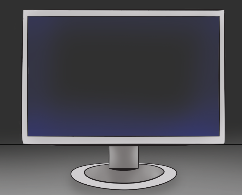

And the last touch for the whole piece was adding the pixels on screen.

The last image in the series was the image + type poster, the plan for this was take inspiration of the "anatomy of trolls" designs but give it my own style to present in this format and to go with the rest of my posters.
To begin I sketched out a fat man outline and then traced it on illustrator to get this:

My next stage was to colour my character in halftones of black and white before adding the blue to the details and clothing of him.


The little troll was really coming together and I was really happy with the results in the remaining time I had! All that was left was to personalise him a bit more and then finish the type layout and anatomy arrows.

Finally after all of the hours put into it the set was finished! i was really happy with the final outcome and went down to the digital print room to print it all! on 2:1 A3 Card. In this brief I learned a lot about composition skills as well as pressured work in small amounts of time in the attempt to produce something in good quality but also legible and communicative.

--------------------------------------------------------------------------------------------------------------------------
Crit
The following are the sheets I picked up when i re-visited my work after the crit.


This feedback sheet explains that I have communicated what a troll is but not in a direct and serious manner but instead, made it humorous instead. It also states that my 'just image' poster doesn't communicate either. They aren't simple as there is a lot going on in them, they display a question and answer the question. Colours aren't inappropriate but the viewer doesn't feel like they are appropriate. They work well as a set, it is clearly evident which is type, image and both. And finally, they are all memorable because they are humorous and have a big visual impact and have fulfilled their full potential. - This feedback was a bit of a mix of the previous two, some feedback was helpful like the idea of using a symbol instead of pixels representing text on my image only poster even though i literally couldn't think of anything which would represent it. But other than that, I don't think they understood the colour scheme in regards to making it feel colder and more futuristic.
If I had more time on this brief I would have a good play with the ideas I have been inspired with from this crit, such as the use of symbolism maybe try answering how to deal with trolls in the posters or prompting to go to a website or phone-service.


