To begin with, it sounds really easy to cover but trust me.. after thinking of "make it look like it's been cut out" you are basically stuck for ideas.
To help me out I made a quick spider diagram to highlight my ideas so I remembered what I wanted to do.

My ideas consisted of A cut out pattern, parts extracted from the letter, a drawing with the effect as if it had been cut out, the idea of extracting information, the idea of extracting files, extracting DNA, vanilla extract of some form, a thief extracting from a home, and finally an extraction tool.
...................................................................................................................................................................
I began with the idea of drawing an 'a' as if it had already been cutout out of the paper.
I wanted to base this project on the font 'Times New Roman' to keep it looking classy and intricate! so yeah, I began with the original form of the letterform and built from there.


I drew the basic shape in pencil and made cuts and changes as to how I wanted or needed. However something I didn't think through was the fact if I cut out this letter... the counter would be loose which I didn't want. I later fixed this after attempting to cut it how it was and making a mess.

This shows the top of the letter's shoulder disconnected but still following the style/pattern-work of the rest of the letter whilst fixing the little mishap which came about before. SUCCESS!

Shading was made as an effect of shadow all done with an HB and 4H pencil, this follows the same process for each letter and the results are displayed below for each one including a little summary of my idea!

With the second letter I drew the idea was to have sections of the letter "extracted" for whatever reason. Turned out quite well with the dotted line effect and the shading so I was happy with it.

My letter 'C' had a very similar idea behind it but a bit more exaggerated. With this example it was the whole letter which had the cut out effect along it to stimulate the thought of "extraction".

The idea behind my letter 'D' was the extraction of information. What I came up with was to research the meaning of 'extract' and then display it within the letter with rings and underlines highlighting key words to represent the action of "extracting information".

Another idea I had for the word "extract" was the computer task of extracting files to make compatible with system software. To do this I followed the standard form of the "e" whilst displaying the words "extracting files" like on a computer screen and then a loading bar in the bridge of the "e".

This was a very tricky one in my opinion. Something I thought of when saying the word "extract" to myself whilst discussing our words in a group, someone helpfully mentioned the act of extracting DNA. So what I did when I got home was I researched the basic shapes and found a long thin one which would be beneficial to the shape of my "F" and then drew it in the corresponding form which worked out quite well.
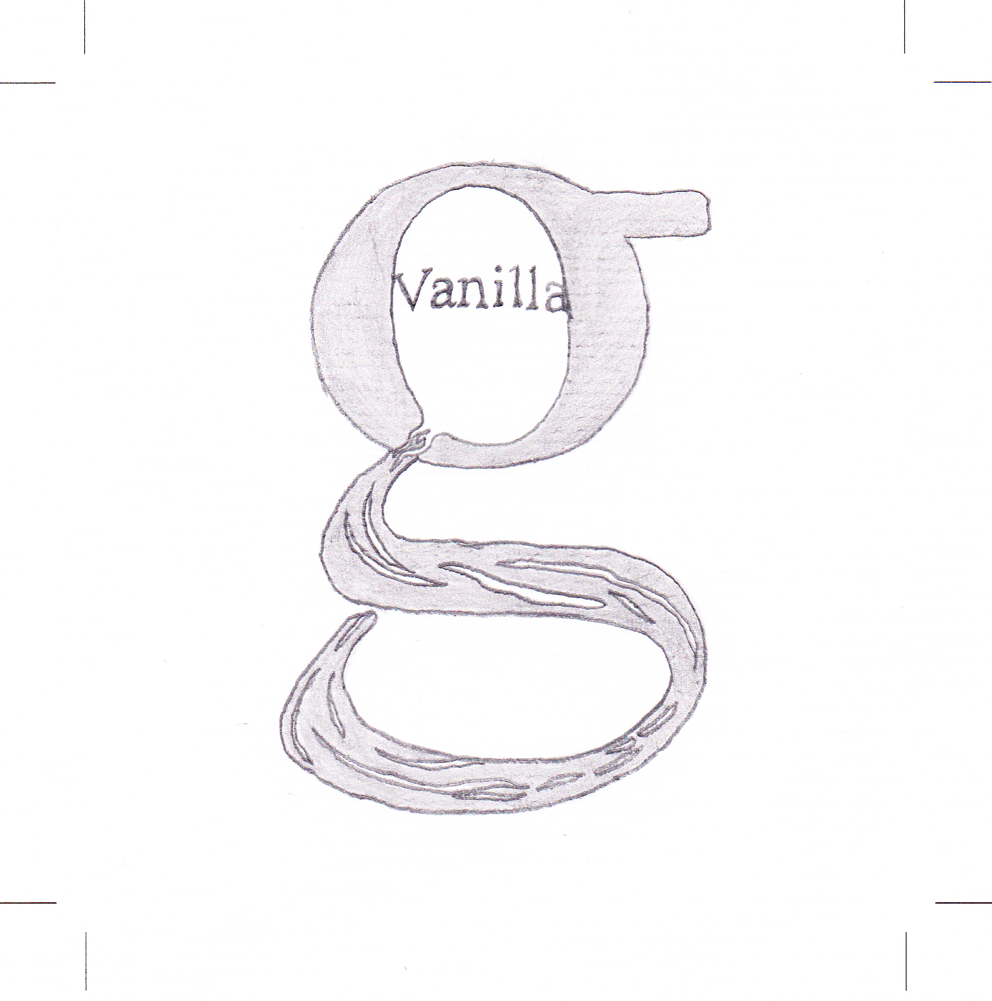
My dad is really into his cooking and my mum is very keen on baking so back home we have absolutely cupboards full of all sorts of shit. When I see the word extract, it reminds me of a time when I was about six and I was rooting through the cupboards and decided to drink a bottle of really expensive vanilla extract. It wasnt even nice.. But yeah.
The letter shows a streak of liquid being poured by the bowl of the 'g' displaying vanilla clearly over it.

Right 'H' looks dreadful here on the scan... But basically this is the simplest one. It consists of the basic outline of an H in Times New Roman with soft shading around the edges. This is the opposite of my A and it shows a cutout of an h sat on a piece of paper. Because it's been extracted.

Almost finished guys, second to last one. This "i" symbolises extraction because I have attempted turning the letter into a tool which would function to take something out of another thing. The dot on the "i" is the object to be extracted.

My last letter "J" symbolises extraction in an attempt of robbery. Extracting from someones home, or wallet or pocket.. taking something that does not rightfully belong to them. Extracting it.
It's supposed to resemble the shape of a person with a black sack full of stolen goods.
Leave your comment