Out of the collection of typefaces that were given to me I chose the first as it stood out the best. I also recognised it from somewhere but couldnt quite figure it out.
I went on identifont.com as suggested by Fred and began answering the questions:

 The second question began the characteristic questions, this one asking about the Q's tail.
The questions got more and more specific to the parts of letterforms until I finally got to the end.
The typeface I had been looking at was a default font on most computers 'Century Gothic'. After identifying what font I was looking at, I started researching what it was about.

It was designed by the Monotype Staff who also designed viral fonts such as Rockwell, Baskerville, Old English and many more.
This font was originally created in 1991 but has been updated twice since in 1995 and 2007.
The font costs between $29 and $284 depending on the package needed but is included in the purchase of Microsoft office for both windows and mac.
Wikipedia:
Century Gothic is a geometric sans-serif typeface designed for Monotype Imaging in 1991. It is a digital typeface that has never been made into actual foundry type. Century Gothic takes inspiration from Sol Hess's Twentieth Century, which was drawn between 1937 and 1947 for the Lanston Monotype Company as a version of the successful Futura typeface, but with a larger x-height and more even stroke width. The Century Gothic face is distinct for its single-storey lowercase a and g. Century Gothic is more closely related to Avant Garde Gothic, designed by Herb Lubalin, and released by the International Typeface Corporation (ITC) in 1970. Century Gothic is similar to ITC Avant Garde in its pure geometry, and does not possess the subtle variation in stroke width found in either Futura or Twentieth Century. However, it differs from ITC Avant Garde in that Century Gothic does not have a descender on lowercase u (making it appear like a Greekupsilon υ), whereas Avant Garde does. Century Gothic also has larger, rounder tittles on the letters i and j, whereas Avant Garde keeps the tittles square and the same width as the letter strokes.
According to the University of Wisconsin-Green Bay, Century Gothic uses much less ink, saving money on printer ink. They reportedly switched their default e-mail and printing font from Arial to Century Gothic because it uses about 30% less ink.[1]
However, the font is also reported to use more paper (since its letters are wider), meaning that the savings on ink are offset by an increase in paper costs.
- Century Gothic is the standard title font in Key Club publications.
- Century Gothic was heavily used in the standing sets of Star Trek: Enterprise as part of the Starfleet standards for that television series' stated time period of the 2150s.
- Century Gothic is the main font of EA's third-person shooter, Battlefield Heroes.
- Century Gothic is the main font for the logo of GMA Network.
- Century Gothic has been used briefly throughout the Jak and Daxter video game series.
- Century Gothic has been used for the beginning and end credits in the US television series House.
- Century Gothic with all caps is the font used in the logo of the Australian Association Football club Western Sydney Wanderers FC.
- Century Gothic is used during the opening titles and the credits of The Hunger Games (film).
- Century Gothic is the default font on the 2012 Summer Olympic Games medallions.
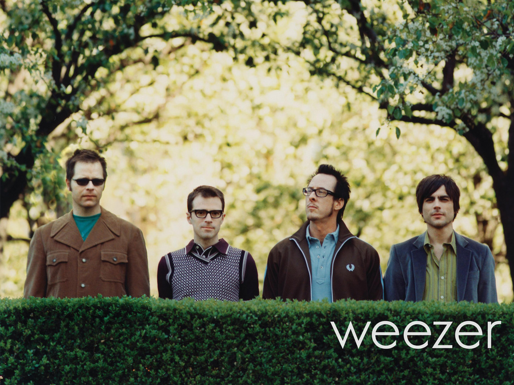
- Century Gothic is the font of the band Franz Ferdinand's logo.
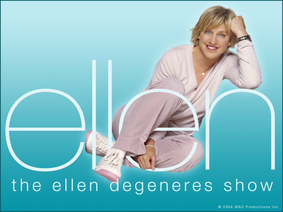
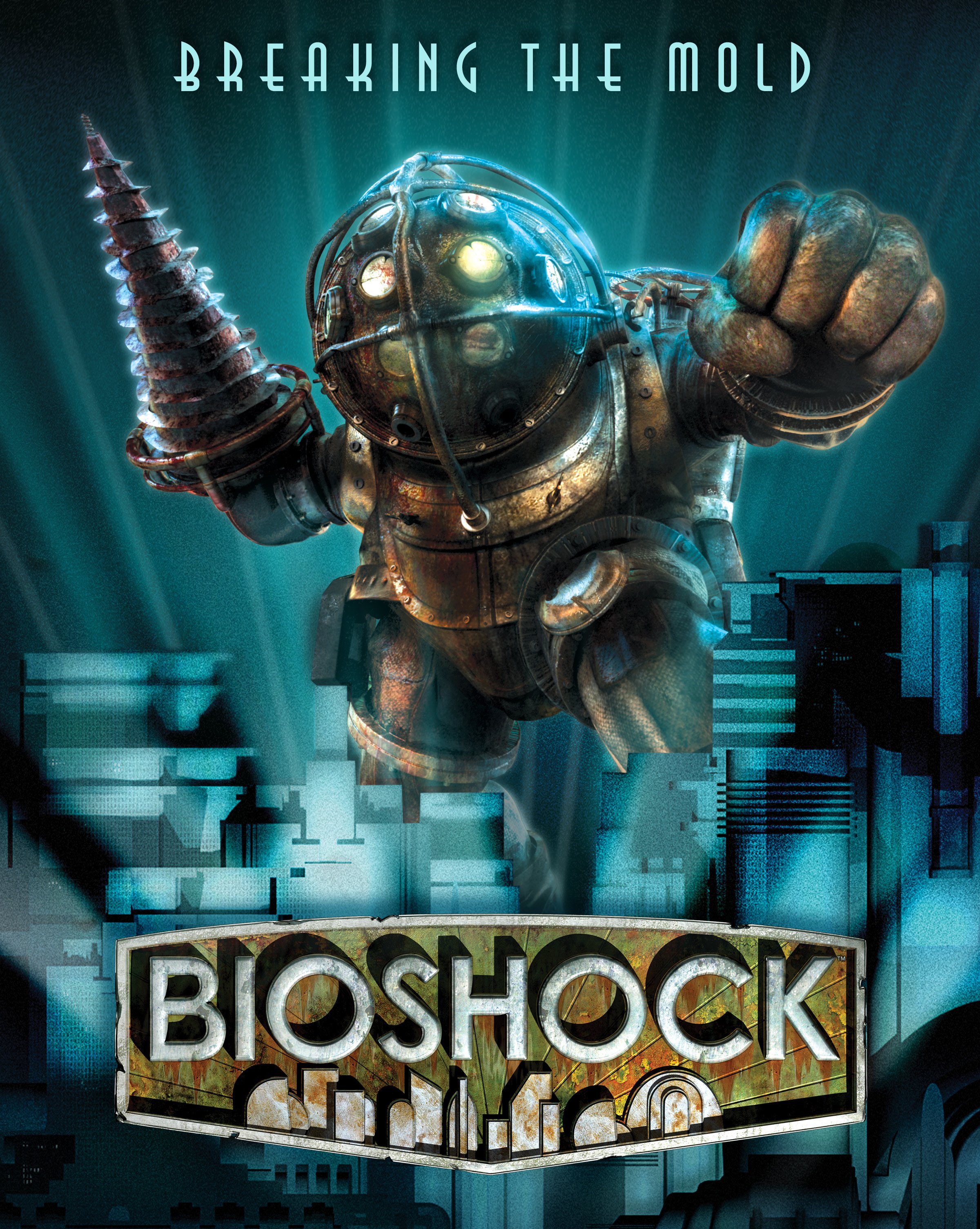
Other examples of Century Gothic i found/remembered are the following:
Leave your comment