Contrast Of Hue.
- Formed by the juxtaposing of different hues. The greater the distance between hues on a colour wheel, the greater the contrast.
- On a white background, blue would stand out the most, as, seen in tone, it's got the darkest value.
- On a black background, yellow stands out the most, as it has the lightest tonal value. Red almost blends in, as it's the mid tone.
- Use black and white very carefully in Graphic Design, as it cancels out colours.
- High contrast colours, RYB, when placed together all fight for attention.
- The contrast of hue and tone are having an impact on our ability to read words.


Contrast of Tone
- Formed by the juxtaposition of light and dark values. This could be monochromatic.
- The Rods in your eyes differentiate tone.
- Monochromatic is the tone of one colour, not just greyscale.
- In greyscale, the primary colours are the lightest, the darkest and the mid tone, when the colour wheel is desaturated.
- Tonal Spectrum, white round to black.
- White and Black on 50% are equally legible, even though the contrasts are extreme, as they're both the same distance from 50%.
- The same principle can be applied to colour. (Example, Red on Orange)


Contrast Of Saturation.
- Formed by the juxtaposition of light and dark values and heir relative saturation.
- Grey background with blue on, we would say the blue shape is blue.
- However, when we add a more saturated blue, the original blue shape looks let saturated, and not really 'blue'.
- This process can be repeated, contrasting more and more, until we get the primary blue, absolute blue, and the rest become very desaturated, looks paler, greyer, duller. etc.
- The same process can be applied to other colours, and tints. (for example, adding white)
- Contrast of Hue, Tone and Saturation, all work in this sense.


Contrast of Extension
- Former by assigning proportional field sizes in relation to the visual weight of a colour. Also known as the proportion.
- Assigning different subjective values to colours, certain colours have certain weights.
- Blue would appear the heaviest, as it's the darkest, Yellow would appear the lightest, as it's the lightest, and Red would be the mid tone.
- We have have less Violet, and more Yellow to have a visual balance.
- In relation to this, we can have less Yellow and more Violet, and we see a stand-out balance.
- If we talk about imbalance, one of this colours is going to jump out. (see slides)
- Using stripes of violet creates an imbalance, and it's easier to look at a block of violet.
- However, then these stripes are spaces out across a bigger area of yellow, your field of view increases, and it become almost easier to look at.It affects our ability to see those colours accurately.
- Hierarchy - spacial quality also applies, as it would with type.
- High contrast colours, always, jump out at you.
- Small amounts of colour, with large amounts of colour work better. Don't use the same amount of colour.


Contrast of Temperature
- Formed by juxtaposing hues that can be considered "warm" or 'cool'.
- The warmest colour would be something which sits in the red-orange area
- The coolest would be in the blue-green area.
- In-between we have colour which movie from the warm to the cool, and vice-versa, on both sides.
- Taking a mid red and pushing it towards violet, you're making it cooler.
- However, this makes the red look more orange, making it look warmer.
- If you add a more orange red, it makes the original red look cooler, and the violet look even cooler.
- However in contrast this makes the orange look warmer.
- The middle section, which is a flat colour, appears to look like a gradient (see slide)
- If you place colours of the decreasing temperature, next to each other in a gradual pattern, it looks like a gradient.
- We can see the (above) colours are separate colours, with black bars in-between them, but when the black is taken away, it's a gradient.


Complementary Contrast
- Formed by the juxtaposition complementary colour from a colour wheel of perceptual opposites.
- Red and Green are complete opposites on the colour wheel, and putting those two colours together looks almost painful.
- Desaturating the blue and the orange in this image, and it becomes a complementary contrast, these two colours are fighting of attention.
- Yellow and Blue and equidistant from the green so when Yellow and Blue stiles are applied, they look better. However, Blue has a similar tone to Green than Yellow, so it's easier to look at.
- If you invert the background, the blue becomes difficult to look at, the the Red becomes calm, it's not fighting for your attention.


Simultaneous Contrast
- Formed by the boundaries of colours which perceptually vibrate.
- Bright Yellow, with Bright Green ontop of it.The longer you stare at it, the yellow begins to turn slightly more orange.
- When you put certain colours next to each other, they start to vibrate.
- Putting Yellow on grey, there's a hint of violet, then with blue and grey, there's a hint of orange.


Fred's Optical Illusion:
- Having Yellow on Violet works, however, it doesn't always work in reverse.
- Having a small almost of Yellow on Violet works, but not when uses repeatedly.
- Yellow is trying to impose it's complementary on our field of vision, to stand out the most.
- However, optical illusions, putting the same colour on two different colours, makes the original colour appear to take the form of stop different colours, based on the simultaneous contrast.
- Using background the make the foreground appear differently. However, if they're joined together, you can see that the colour does not change.
- You can also, by staring at a black dot, burn an invert of the surrounding image onto your retinas.


Red Object Experiments:
- On Yellow: Darker Tone, Different Hue, More saturated, Warmer temperature, High extension, not much of a complementary contrast, slightly blue background
- On Green: Darker Tone, Different Hue, More saturated, The red looks warmer, in comparison, high complementary contrast, blue fade on the green.
- On Red: Darker Tone, Similar Hue, more saturated, It looks warmer, and the background almost goes towards a violet colour, whereas the envelope goes more orange, Low extension contrast, low complementary contrast, as they're the same colour, more or less, it makes the area around it look violet.
- On Orange: Darker Tone, different hue, however, it's not too substantial, around the same saturation


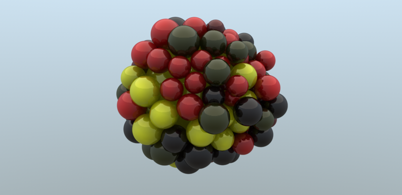
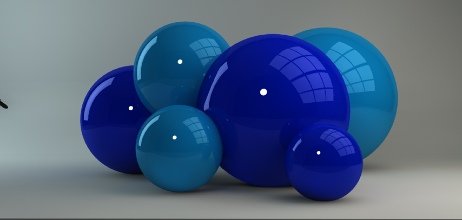
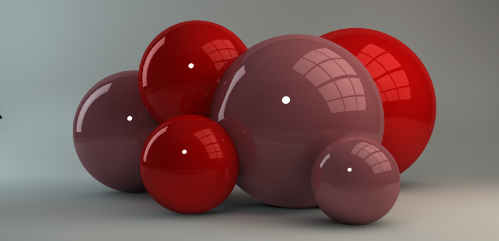
All objects created on cinema 4d for software practice as well as contextual colour studying.
