Archives

OUGD503 - Studio Brief 1 - Individual Practice - BASSment's 1st Birthday Flyers

The client got in touch with me to design the promotional flyer for their year anniversary event. He sent me all of the information and told me that it had to be A5 and double sided.


I jotted down a few ideas and pitched them to him and he really liked my idea about making the flyer an illustration of a cake as it's theme was 1st Birthday.

After that I got sketching.


After I sent him the above proof he said he liked where it was going so I drew it out again but with more detail.


After proofing him again he said it was perfect and he was looking forward to seeing it develop. I took a satellite photo of the drawing and then used the pen tool on illustrator to perfect it all.


He was really happy with the results so I went on to add colour, final details and then the logos.


The other side was very simple and just required a fixed grid to keep everything in line, the client was very happy with this after a few amendments and the detail of the crumbs over the writing.


I charged him £70.00 through paypal and then sent him print & web files.

OUGD503 - Studio Brief 1 - Individual Practice - D&AD New Blood Awards - Purdey's Initial Design Boards & Crit


Questions I would like to ask in regards to the this project include the relevance of the product itself, as well as the design aesthetics.

1. Should the original bottle size/shape change  from the original? Will the new design aesthetics cause enough attention to the bottle that changing it would just be pointless work?

2. Does the custom-made typeface work with the energetic tone of voice I am trying to convey? Does it need to change? If so, how?

3. Should the same typeface be used for the Natural Energy design as the Rejuvenate design? If not, should it express more nature orientated aesthetics?

4. Should illustration be used in any way on the bottle? Would it benefit the effectiveness of the communication? Or simply make the bottle look more appealing to the consumer?

Crit.

As a whole, the crit was very successful and I left with a very fixed and solid set of aims and objectives for this brief. It was also good to have an outsider's opinion on what I had done, where I am going and what I should do.

The answers I got from my questions were the following:

1. Experiment - the brief asks to push the boundaries of bottle packaging. You will never know until you try.

2. It works because it represents the 'busy lifestyle' of your audience. Does look quite messy but the use of clean structured type along with it keeps it harmonised.

3. I think it fits as it shows the drinks link. Maybe consider a different quote for the natural energy drink?

4. It could work but it would have to be very minimal & simple. The typography is enough to create the identity and connection already.

On the peer feedback sheet we got given to fill out, my peers filled it out to the following:

Comment on the effectiveness of the product/proposal in relation to the original brief.

Strengths: Colour works well to help product stand out on shelf. Hand-made text appeals to a wider audience (down to earth).

Suggestions: Could experiment with unconventional bottle shapes. Maybe try the company name at the top to avoid confusion. Swap 'Rejuvenate' with 'Purdey's'. Try different colours with sections of text to help break up information.

Comment on the appropriateness of the response to the identified audience and/or context.

Strengths: Hand-made type communicates busy lifestyle well and appeals to the age range stated in the brief. Quote is relevant and inspiring.

Suggestions: Maybe try more calming colours to represent the refreshing/health benefits. Red is a little intense.

Comment on the visual quality of the final resolution.

Strengths: Communicates the final product well, could be more in depth.

Suggestions: Show in real life context? More variations eg. colour-ways.

Comment on the quality/effectiveness of the presentation of the product/proposal.

Strengths: Communicates well but could be more clearly organised and more content.

Suggestions: Try to use less text. Space out over more boards for better impact. Write in 3rd person instead of 1st. Show product in context.

General comment on work presented.

Overall a good design, just need finishing up and more impact with presentation.

Self initiated action plan:

1. Work more into different bottle shapes/sizes/designs. The brief wants me to push the boundaries, what are the boundaries and where can I push them to?

2. Try a couple of variations of hand-rendered type to make sure I am using the best I can produce. Work out appropriateness by trying it out in the current layout.

3. Come up with an equally inspiring quote as I have for the Rejuvenate drink for the Natural Energy drink.

4. Experiment with minimal illustration either around the hand-rendered type or throughout.

5. Create realistic mock-ups of what it would actually look like, put effort in to make it realistic, the smallest things make the biggest difference. Show them in a real life context too.

6. Look over professional design boards and then plan out impacting, impressive design boards for my project which gets my message across professionally and quickly. 

OUGD503 - Studio Brief 1 - Individual Practice - D&AD New Blood Awards - Purdey's

Brief Analysis:


Why have you chosen the brief?

I am yet to experience a packaging design brief for an already existing product which has values and ethics behind it. I enjoy the drink myself and it'd be a good place to start taking in consideration it's restrictions and limits.

What do you want to get out of the brief?

I want to win and gain recognition, confidence, reputation and satisfaction from my work at the same time as learning more about packaging design through the research, development and execution of my response.

What do you want to do/make/propose in response to the brief?

I would like to bring something different to the table for Purdey's, I want to design a container for the health drink which would make it stand out on shelves, attract people to the product and define what the drink's values and contents are visually to give their audience a bigger inclination towards it rather than it's competitors.

What do you need to do/make/propose? 

A recognisable, different approach to packaging a product which works as a health benefit to consumers. This needs to push the boundaries of what we know as energy/health products and put it to the forefront of it's competitors.

After I answered my questions about the brief I rewrote it to focus my direction better than in the actual brief's format.


I then went on to mind-map ideas and plans to channel my thoughts better, this also helped develop those plans into something better.


After building on concept development I sketched out different bottle shapes and sizes.


To figure out to myself what a person would feel when drinking their product I wrote a list of words down as I drank a bottle myself to put down everything.

Fruity, energy, awake, rejuvenated, healthy, good, kind, thirst, natural, revitalising, senses, chilled.

Including these words would engage a connection between a person's natural senses and the product. My favourite words were good, kind, fruity, and revitalising.

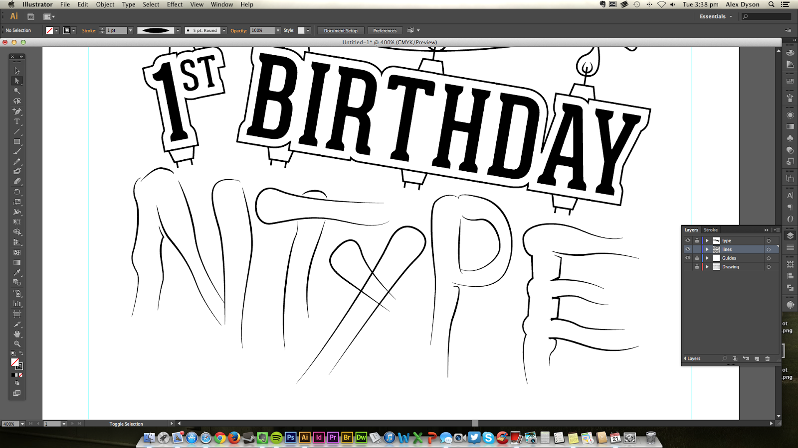
I drew out some bottle templates and quickly jotted out layout ideas to start my development. I wasn't sure if imagery would be used yet so I kept to type only.


After my first six sketches, I realised how much impact type alone could have on the bottle. By capturing the right feelings, thoughts and triggering the consumers subconscious I could make the bottle far more appealing mentally which would help towards a success.

I thought of the phrase "Rejuvenate: Your mind, your day, your life, your family, friends, the world around you. Feel Good. Feel Right" I don't know where it came from but it came to me whilst I was drinking it and it felt like I had defined the whole concept of the drink benefitting the consumer's state of mind, how they'd feel that day, how it'd benefit their day-to-day life, how that would then make positive things happen with the person's state of mind, and then how it will also benefit the world around them because of their uplifted mood and also because the bottle is 100% recyclable and eco-friendly. Finally hitting home by telling the consumer to feel good, and that is how they should feel.

I felt like this message required an energetic, artistic typeface that spoke the message visually to set the tone and gather the interest for them to read it.

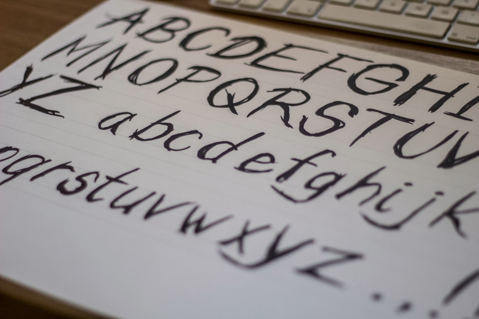
To deal with this I decided to make my own typeface to null out copyright problems, which I did by hand.


I then laid it all out to what I imagined and changed it once to feel entirely confident with it.


After I was happy with the layout I added the nutritional information and intro of the drink around it.


As I had limited time until our crit, I decided to keep the Natural Energy version the same but with different description and different colour even though the type and words would change. This way I could show the colour and consistency in style even though it'd be slightly different when submitted.


Now I had two labels to show, I also needed to put it into context and mock it up as if it was a real object.


I found this really difficult as I had designed the shape of the bottle too, this kind of put it into context but not very well.


OUGD504 - Studio Brief 3 - Design Boards.


OUGD504 - Studio Brief 1 - Final Product.

The Print Volumes.

Series of three books held together in engraved wooden bound folder. Covering the printing techniques of screen printing, lino-cut printing and embossing. Each book's cover is made by the relevant printing method.


Copyright 2010. All rights reserved.